understanding the basics of Colour.

Issac Newton discovered that by shining white light through a prism, you could separate this into the colour spectrum.
(http://architeckne.files.wordpress.com/2010/08/prism-02.png)

From this, Newton created what is known as the colour wheel, categorising colour into three categories- Primary, Secondary, and Tertiary colours.
(http://upload.wikimedia.org/wikipedia/commons/b/b2/Boutet_1708_color_circles.jpg)
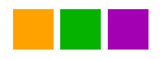
Primary Colours.

Secondary Colours.
These are the colours that are created by a combination of two primary colours.

Yellow + Blue = Green
Red + Blue = Purple
Note that there is only one secondary colour from the combination of the two primary colours. These secondary colours are pure colours in their own right, an equal visual balance of the two primary colours, where neither of the two primary colours are dominant.
Tertiary Colours.
There are, of course, a vast range of variations of colours between the primary and its secondary. These are known as tertiary colours. For example, red-orange, yellow-orange, blue-purple, and so on.
Complimentary Colours.
In colour theory complementary colours appear opposite each other on colour models such as the colour wheel. The colour complement of each primary colour (primaries are red, yellow and blue) can be obtained by mixing the two other primary colours together. So the complementary of red is green (a mix of yellow and blue); the complementary of blue is orange (a mix of red and yellow); and the complementary of yellow is violet (a mix of red and blue).
(http://www.tate.org.uk/learn/online-resources/glossary/c/complementary-colours)
Complimentary colours have been used by many artists over the centuries (especially the Impressionists) to draw attention to particular objects, or to maximise the effect of a particular landscape.
Impression, sunrise, by Claude Monet, 1872. Which complimentary colours have been used? How does this impact on the painting?
Van Gogh: Six Sunflowers, 1888. Van Gogh has used lots of contrasting colours to to define shape and colour.
Tints and Shades.
When we observe colour in our world the light source has another impact on colour. The colour could be a secondary orange, for example, but could be a lighter or darker as the light hits its surface. A lighter version of a colour is known as a tint (with white), and a darker colour known as a shade (with black). A tone of a colour is a colour with grey.
(http://patsysmiles.com/wp-content/uploads/2014/03/Tints-Shades-and-Tones.png)
No comments:
Post a Comment